transitionを使ってエフェクトをつけてみる
css3の登場で、我々マークアップエンジニアもずいぶんと簡単に「動き」を付けることが出来るようになりました。
css3は本当に楽しいです(`・ω・´)
今回はそんなcss3より、transition(トランジション)という時間の変化を操るプロパティの使い方をメモしたいと思います。
時間の変化というと想像しにくいのですが、実は当ブログでも右ナビのボタン群にはすべて指定してあって、オンマウス時に少しほわっと切り替わる感じがすると思います。パキっじゃなく、ほわんっ!これがtransition!ぜひ試してみてください!
transitionプロパティとは
transitionプロパティは、transition効果(時間的変化)をまとめて指定する際に使用します。
時間的変化といわれてもいまいちピンとこないと思うので、以下のサンプルでどんな変化を付けることができるのか試してみたいと思います!
これさえ覚えればOKな書き方
サンプル| 普通のhover | transitionを適用したhover |
|---|---|
右の「transitionを適用したhover」ではゆっくりと色が変わるのがわかりましたか?これがtransitionプロパティを使用して表現できる変化なのです。
変化のさせ方はいろいろとあるのですが、サンプルはhover時のボタン色を赤から青に1秒かけて変化させるやり方です。
htmlとcssの指定は以下です。
css
button {
width:125px;
height:50px;
border:none;
border-radius:5px;
color:#FFF;
background-color:#f06060;
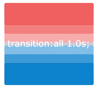
transition:all 1.0s;
}
button:hover {
background-color:#0e83cd;
}
POINT
1.0sは1秒かけて変化するという意味です。0.5sだと0.5秒。※単位はs
transitionの指定は”変化前に当たる要素”に指定してあげることです。
変化を考えるときは、通常時(button)とオンマウス時(button:hover)それぞれの指定を書き、その2つをどのくらいのスピードで切り替えるか、というのを考えると書きやすいです。
いろいろやってみた!transitionで動かすボタン7選
オンマウスしてみてください!
htmlは上のサンプルと同じになります。
また、これより先はあくまで筆者の勝手な表現です(笑)
■背景のみをほわっと切り替えてみる
button {
	width:150px;
	height:50px;
	border-radius:5px;
	color:#FFF;
	font-weight:bold;
	background-color:#00B285;
	transition:background-color 3.0s;
}
button:hover {
	border:2px solid #CCC;
	color:#333;
	background-color:#FFF;
}
POINT
allだとすべてのプロパティに変化が適用されますが、transition:background-color 3.0s;と指定すると、background-colorのみ3秒かけて変化させることが出来ます。
よってこの例は、背景色だけじわじわと変化させ、ボーダーや文字色は普通に切り替えたものです。
■ヒュンっとまんまるにしちゃう
button {
	width:150px;
	height:70px;
	border-radius:5px;
	color:#FFF;
	font-weight:bold;
	background-color:#00B285;
	transition:all 0.3s;
}
button:hover {
	border-radius:35px;
	width:70px;
	height:70px;
}
■キュっとサイズを変てみる
button {
	width:150px;
	height:50px;
	border-radius:5px;
	color:#FFF;
	font-weight:bold;
	background-color:#00B285;
	transition:all 0.5s;
}
button:hover {
	width:100px;
	height:35px;
}
■ピシャっとなんか横切る
button {
	width:150px;
	height:50px;
	border-radius:5px;
	color:#FFF;
	font-weight:bold;
	background-color:#00B285;
	transition:all 0.3s;
	position:relative;
    z-index:2;
}
button:hover,
button:active {
	color:#00B285;
}
button:after {
	width:0%;
	height:100%;
	border-radius:5px;
	background-color:#FFF;
	content:"";
	position:absolute;
	top:0;
	left:0;
	transition:all 0.3s;
    z-index:-1;
}
button:hover:after,
button:active:after {
	border:2px solid #00B285;
	width:100%;
}
■ピシャっとなんか降りてくる
button {
	width:150px;
	height:50px;
	border-radius:5px;
	color:#FFF;
	font-weight:bold;
	background-color:#00B285;
	transition:all 0.3s;
	position:relative;
    z-index:2;
}
button:hover,
button:active {
	color:#00B285;
}
button:after {
	width:100%;
	height:0%;
	border-radius:5px;
	background-color:#FFF;
	content:"";
	position:absolute;
	top:0;
	left:0;
	transition:all 0.3s;
    z-index:-1;
}
button:hover:after,
button:active:after {
	border:2px solid #00B285;
	heght:100%;
}
■シュっとひげのおじさんが出てくる
button {
	width:150px;
	height:50px;
	border-radius:5px;
	color:#FFF;
	font-weight:bold;
	background-color:#00B285;
	transition:all 0.3s;
	position:relative;
}
button:before {
	border-radius:5px;
	content:url("シュっと出てくる画像");
	position:absolute;
	top:120%;
	left:75%;
	transition:all 0.3s;
}
button:hover:before {
	top:30%;
}
■ザザっと素早さの高い液体金属がにげる
button {
	width:150px;
	height:50px;
	border-radius:5px;
	color:#FFF;
	font-weight:bold;
	background-color:#00B285;
	transition:all 0.3s;
	position:relative;
}
button:before {
	border-radius:5px;
	content:url("ザザっと逃げる画像");
	position:absolute;
	top:17px;
	left:-120%;
	transition:all 0.5s;
}
button:hover:before {
	left:120%;
}
beforeやafterを上手く活用するといろいろな表現が出来そうなので、引き続きいろいろ試してみたいと思います!


今日のひとこと:先日初体験したぎっくり腰の後遺症がまだ治らないとです。